Municipality of Heemstede
Corporate Identity Re-styling
The Municipality of Heemstede required enhanced visibility, visual cohesion, and modernization across all public communication channels.
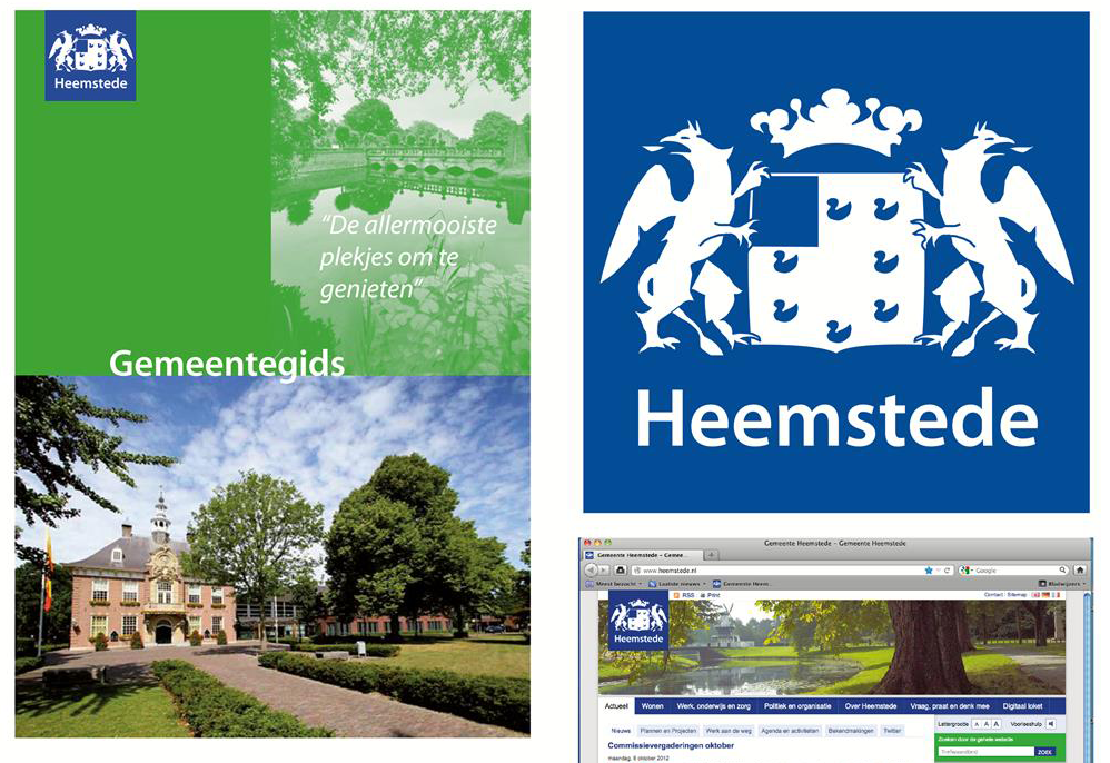
Visual Transformation: Translated the municipality’s core values (powerful, reliable, professional, driven, and transparent) into a vibrant, contemporary visual identity.
Logo Modernization: redrew the traditional coat of arms into a clean, balanced, and timeless emblem. Removed redundant typography to maximize clarity and modern impact.
Strategic Color Systems: Introduced an expanded, fresh color palette where a professional deep blue meets an organic grass green (representing the area's nature and space), paired with subtle, vibrant secondary accents for digital layout.
Full Ecosystem Rollout: Refreshed virtually the entire public communication suite, from the primary municipal website to print publications and official city guides.
Role: Lead Brand Designer
Deliverables: Brand Strategy, Identity & Logo Design, Brand Style Guide, Cross-Media Implementation